
Direct client · Commercial work
2018–2022Diamond Venom.
One Identity. a Recognizable Product Family.
Brand Strategy, Identity & Packaging Design
Logo, Product Systems, Packaging, Digital
Direct Client · Commercial Work
THE BRIEF
One Identity. a Recognizable Product Family.
Diamond Venom needed an identity that could carry a growing family of products. I developed the brand mark and visual architecture, then extended the system across gummies, drops, and digital marketing materials.
MY CONTRIBUTION
I created the identity, logo lockups, product-line marks, packaging layouts, production files, and digital assets. The design work connected an expressive central idea with repeatable rules for new products and formats.
01 / The challenge
Make the Central Idea Unmistakable.
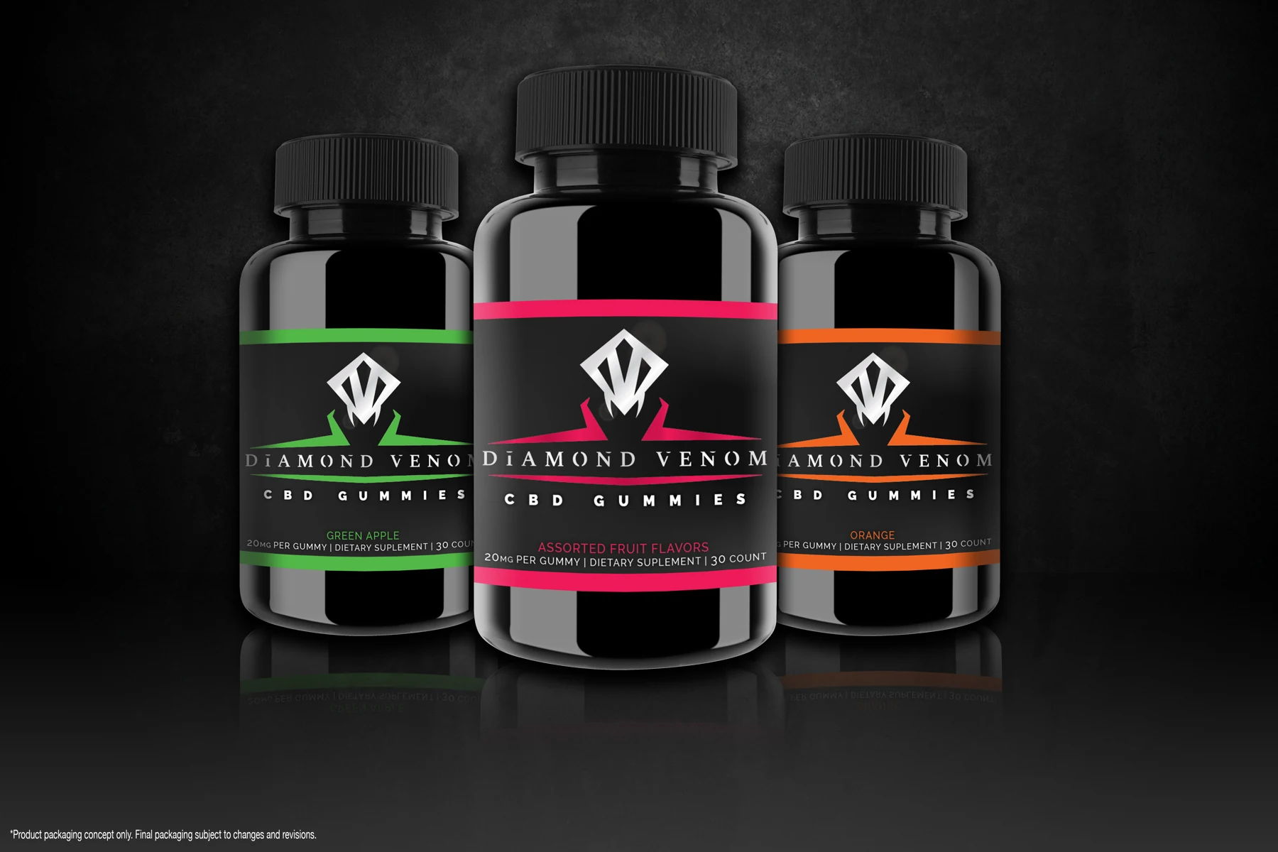
The founders wanted a distinctive, premium identity with enough flexibility to expand. The mark combines the geometry of a diamond with the shape of a fanged snake’s head. That dual reading became the foundation for the visual language.
02 / The decisions
Keep Recognition Constant. Let Variants Change.
Dark packaging and a consistent logo hierarchy gave the product family a common foundation. Color accents differentiated variants, while repeatable layouts connected different container sizes and product types.
03 / The delivery
Carry the Identity Into the Launch Materials.
I extended the packaging system into product presentations, digital banners, and supporting brand assets. The same visual hierarchy could support a small banner, a product render, or a full product-family presentation.
OUTCOME & REFLECTION
An Identity Carried Into a Commercial Launch.
The brand launched online and appeared in regional smoke shops. The strongest evidence here is the design system itself: an original mark, consistent product architecture, and packaging that translates across formats. Sales and conversion data are not claimed.
Direct client identity and packaging work by Marceli Jasinski. Product images shown include design mockups and renders.
NEXT PROJECT
BoostFundz
A web-first fundraising experience for organizers, businesses, and donors.